redline 145
posted by Paul Rivoche at 12:47 PM
![]()
![]()


I love being a channel for creativity and since roughly 1979 I've been creating comics covers and pages, graphic novels, animation background designs, illustrations, and more.

9 Comments:
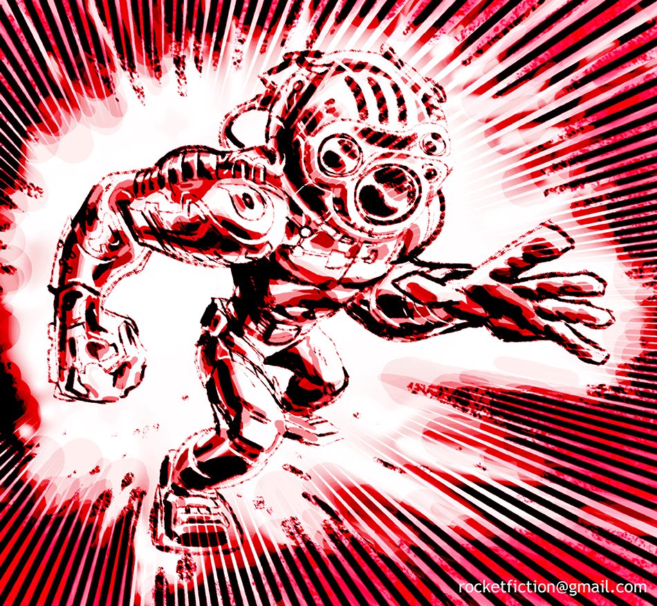
It's so interesting to see the effects of colour from this blog to the Rocketfiction one.
This one, for instance: It's like Alexander Rodchenko vs. Jack Kirby! So much more graphic. And the one with the house in the swamp...feels evil (or at least stinking hot), and the full colour seems more like a little haven...it's fun to compare reactions.
great stuff as always, Paul!
thanks for commenting Warren....! I do these all in red first...then play around with color, exactly as you say, it's interesting to see the effect of the same composition in a different color scheme.
This comment has been removed by the author.
thanks joe, nice to see you back again.
This comment has been removed by the author.
Not had time to update...too busy!!
But redsketch will return...!!
COOOL action packed illo!
This comment has been removed by the author.
Post a Comment
<< Home